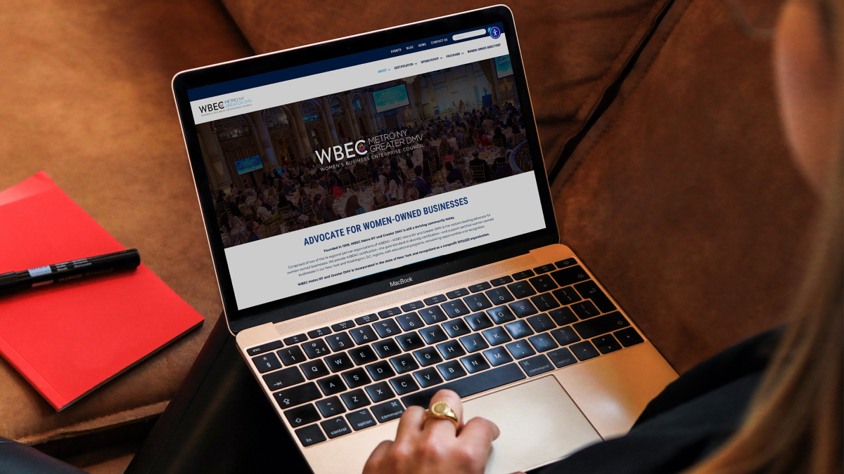
Reimagining a website to better serve a growing network of women entrepreneurs
WBEC Metro NY & Greater DMV
Responsibilities
- UX research and information architecture
- Responsive web development
- SEO and accessibility improvements
- Collaboration with stakeholders
Role
UX/UI Designer & Web Developer
Tools
WordPress, HTML/CSS/JS, SEO tools
Problem
The Women's Business Enterprise Council of Metro NY and Greater DMV, or WBEC NY DMV, supports a network of women entrepreneurs through certification, programming, and business resources. Their outdated website made it difficult for members and potential applicants to find information about benefits and the certification process. Its site structure and design reinforced the incorrect assumption that the organization was developed with the mindset of a demographic inexperienced with modern design conventions.
Challenges
- Important information about certification and programs was difficult to locate
- Navigation and content structure had grown inconsistent over time
- Visual design lacked brand consistency across digital platforms
- The website needed to support frequent feature requests and program updates
Because the site serves both existing members and prospective entrepreneurs, unclear navigation created friction in the onboarding journey.
Goals
- Improve the user experience for accessing key information
- Establish consistent branding across digital touchpoints
- Create a flexible system that could support evolving organizational needs
- Deliver design improvements while adapting to scope changes and deadlines
Technology Stack
Stakeholders required keeping the existing CMS. The builder tools implemented were new to me since I was brought onto the project after scope was defined, so I took it as a hands-on learning opportunity.
Evolving Content Needs
During the project, the organization frequently introduced new feature requests. To keep the project on track, I:
- prioritized high-impact updates
- designed modular components for quick implementation
- balanced design improvements with timeline constraints
Process
Defining the User Experience
Two primary audiences emerged with sets of different needs:
Prospective Members
- Learn about certification
- Understand eligibility
- Find application steps
Existing Members
- Access programming and events
- Stay updated on resources and opportunities
UX Strategy
To support these needs, I focused on:
- simplifying the information architecture
- clarifying navigation pathways
- prioritizing high-value content
Information Architecture
Key Improvements
- Consolidated scattered content into clear program hubs
- Prioritized certification information within navigation
- Reduced content redundancy across pages
Brand Consistency
The redesign introduced:
- consistent typography hierarchy
- standardized colors and spacing
- reusable UI components
This helped align the website with the organization’s broader brand identity while improving readability and accessibility.
Responsive Design
The interface was optimized for mobile users, ensuring entrepreneurs could access resources on any device.
Implementation
Development highlights
- Built responsive page layouts in WordPress
- Implemented SEO best practices across key pages
- Improved accessibility through semantic markup and improved contrast
- Created flexible templates to support future content updates
Improvements/Results
Outcomes
- Improved navigation clarity for certification and program information
- Established consistent design patterns across the website
- Enabled the organization to add new program content more easily
According to a follow-up survey:
- Improved awareness of WBE small- or Black-owned businesses and diversity
- New website users went up 841.5% since implementing a new social media campaign and launching a new website
- 52% increase in search engine optimization score
Reflection
What I’d continue improving:
- Expansive user testing with business owners navigating the certification process
- developing a more comprehensive design system for future updates
- Technology stack audit to implement a system that would allow for modern, aesthetically pleasing design
Redesigning WBEC NY/DMV’s website demonstrated how thoughtful UX improvements can help mission-driven organizations better support their communities. Through improved information architecture, consistent design, and flexible development, the website now provides a clearer path for women entrepreneurs seeking certification and resources.